 React.js
Orchestrating animations with Framer Motion in React.js [Step By Step Tutorial with Examples]
Framer Motion is an open-source motion library, which drives Framer X’s animations and gesture capabilities in React.js projects. If you are familiar with Popmotion, Framer Motion is the successor to the popular Pose animation library. Both libraries provide declarative API, which makes creating and orchestrating animations in React.js projects easy to implement.
In this tutorial, I want to demonstrate how to orchestrate animations with Framer Motion in React.js projects. We will implement animations in a declarative and imperative way. The output of this tutorial is a layout with sidebar menu, which we will animate with its elements.
Getting Started
Before we get started, we should know a bit Framer Motion API, which consists of Framer API and Motion API. The main difference between the two APIs is that in Framer Library the fundamental building block is a Frame, while Motion uses motion components. A Frame always renders a div, while motion component can be used for every valid HTML and SVG element.
<Frame x={100} />

<motion.div style={{ x: 100 }} />
For more details you can check Framer Motion’s documentation. In this blog post, I will use motion component.
Sidebar Layout
Let’s create a page layout with sidebar. I will use styled-components and CSS Flexbox layout. Later, we will add Framer Motion into the project and create sidebar animations.
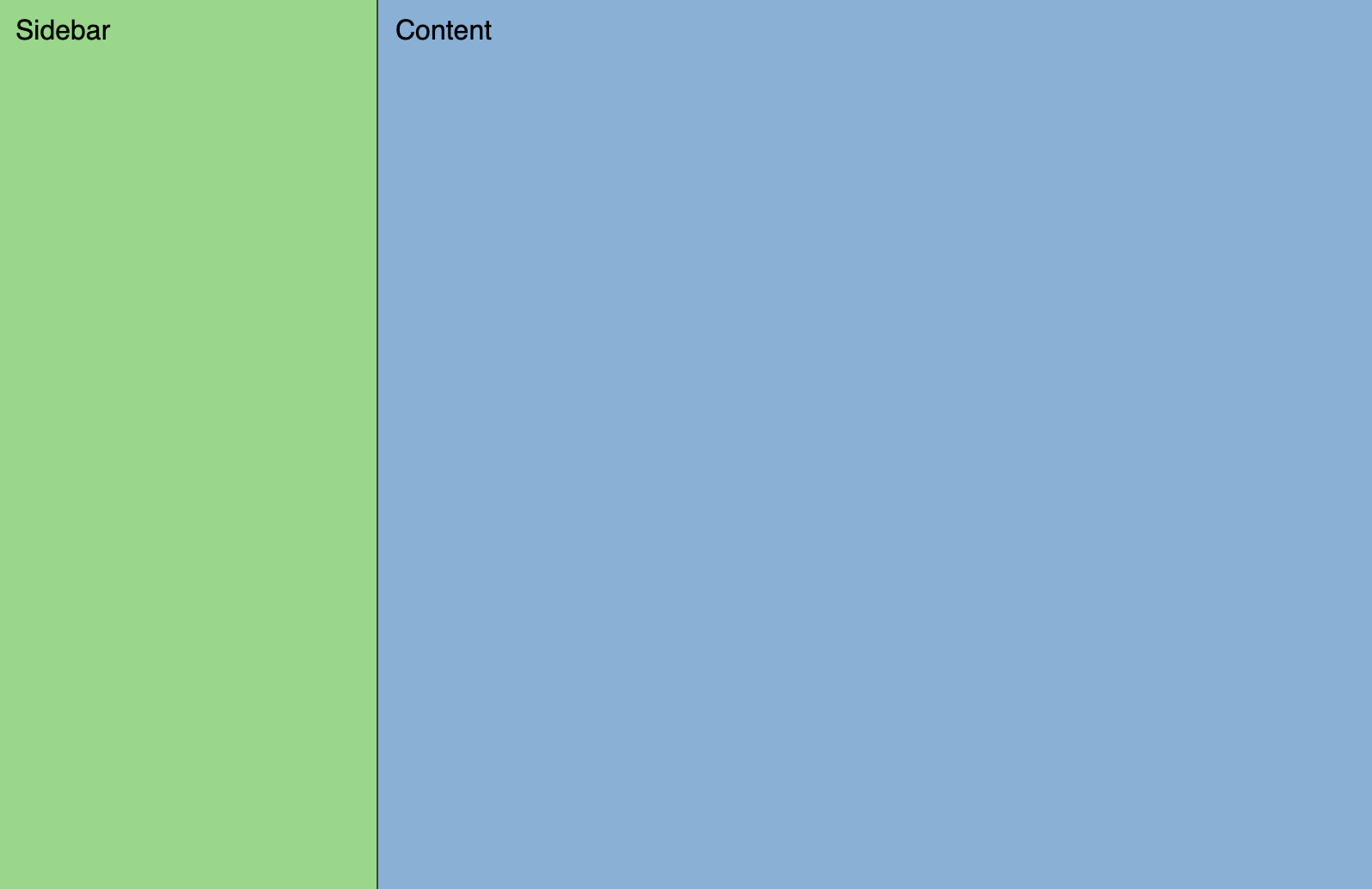
index.jsx
import React from "react";
import ReactDOM from "react-dom";
import { Container, Sidebar, Content } from "./styles";

function App() {
 return (
   <Container>
     <Sidebar>Sidebar</Sidebar>
     <Content>Content</Content>
   </Container>
 );
}

const rootElement = document.getElementById("root");
ReactDOM.render(<App />, rootElement);
styles.js
import styled from "styled-components";

export const Container = styled.div`
 display: flex;
 min-height: 100vh;
 min-width: 0;
 font-family: sans-serif;
`;

export const Sidebar = styled.div`
 display: flex;
 min-width: 0;
 flex: 0 0 200px;
 flex-direction: column;
 border-right: solid 1px #3c4245;
 background-color: #98d788;
 padding: 10px;
`;

export const Content = styled.div`
 display: flex;
 flex-direction: column;
 flex: 1;
 min-width: 0;
 padding: 10px;
 background-color: #88afd7;
`;
Installation
Framer Motion requires version React 16.8 or greater. You can install framer-motion from npm by command:
npm install framer-motion
Animation
We installed Framer Motion and created layout with static sidebar. Now, we can import motion component and use it for every valid HTML and SVG element. Motion components are DOM primitives optimised for animations and gestures. Motion components are animated via the animate prop.
import { motion } from "framer-motion";

export const Sidebar = styled(motion.div)`
  display: flex;
  min-width: 0;
  flex-direction: column;
  border-right: solid 1px #3c4245;
  background-color: #98d788;
  padding: 10px;
`;

<Sidebar
  animate={{
    width: "200px"
  }}
>
  Sidebar
</Sidebar>
Properties in animate property represent the final state of the animation. In our case, we passed single property width with value 200px. When sidebar is rendered, the animation is executed.
Initial
Initial property allows setting initial values of animatable properties. In our example we added width: "80px" into initial property.
<Sidebar
  initial={{
    width: "80px"
  }}
  animate={{
    width: "200px"
  }}
>
  Sidebar
</Sidebar>
State
If we want to switch between element styles in React.js projects, we usually use component state. Let’s add a button into sidebar, which click action toggles sidebar state sidebarCollapsed. We can use this state to control our sidebar animation.
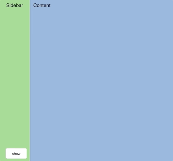
index.jsx
class App extends Component {
 state = {
   sidebarCollapsed: true
 };

 toggleSidebar = () => {
   this.setState({ sidebarCollapsed: !this.state.sidebarCollapsed });
 };

 render() {
   const { sidebarCollapsed } = this.state;
   return (
     <Container>
       <Sidebar
         initial={{
           width: sidebarCollapsed ? "80px" : "200px"
         }}
         animate={{
           width: sidebarCollapsed ? "80px" : "200px"
         }}
       >
         <span>Sidebar</span>
         <CollapseBtn onClick={this.toggleSidebar}>
           {sidebarCollapsed ? "show" : "hide"}
         </CollapseBtn>
       </Sidebar>
       <Content>Content</Content>
     </Container>
   );
 }
}
Variants
You can extract animatable properties from animate property into a separate object. Then you can define these objects as variants, which can be referred by label.
Later, we will need variants to orchestrate sidebar animations.
const COLLAPSED_WIDTH = "80px";
const EXPANDED_WIDTH = "200px";

export const SidebarVariants = {
 expanded: () => ({
   width: EXPANDED_WIDTH
 }),
 collapsed: () => ({
   width: COLLAPSED_WIDTH
 })
};
render() {
   const { sidebarCollapsed } = this.state;
   return (
     <Container>
       <Sidebar
         initial={sidebarCollapsed ? "collapsed" : "expanded"}
         animate={sidebarCollapsed ? "collapsed" : "expanded"}
         variants={SidebarVariants}
       >
         <span>Sidebar</span>
         <CollapseBtn onClick={this.toggleSidebar}>
           {sidebarCollapsed ? "show" : "hide"}
         </CollapseBtn>
       </Sidebar>
       <Content>Content</Content>
     </Container>
   );
 }
Control animations declaratively
By default all animations start simultaneously. By using variants, we have access to Transition object and its orchestration props.
Transition defines how values animate from one state to another and orchestration props allow you to orchestrate animations in a declarative way. You can define relationships between child and parent animations using when property or you can delay children animations. Before you start orchestrating animations, it’s worth mentioning how animation propagation works:
If a motion component has children, changes in variant will flow down through the component hierarchy. These changes in variant will flow down until a child component defines its own animate property.
Source: https://www.framer.com/api/motion/animation/#propagation
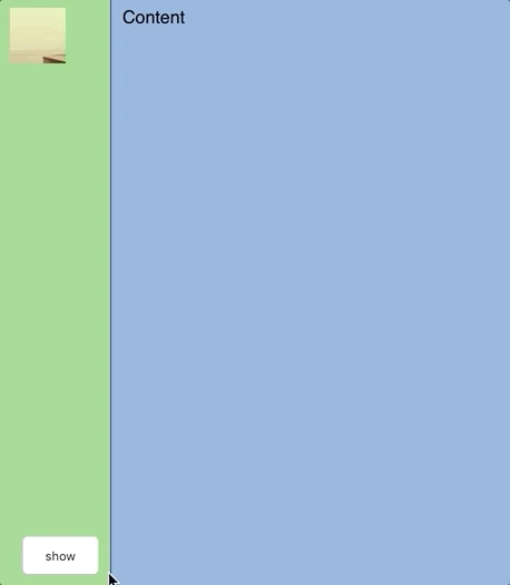
Let’s add an avatar into sidebar and change its size based on sidebar state. You can see in code snippet below that avatar dimensions are controlled by scale property. This property is not a valid CSS property, but framer-motion’s property which represents CSS transform scale property. Similarly, there are some other properties such as rotate, skew and others. You can find the complete list here.
export const AvatarVariants = {
 expanded: {
   scale: 1.5,
   x: 13,
   y: 13
 },
 collapsed: {
   width: "50px",
   scale: 1,
   x: 0,
   y: 0
 }
};

export const Avatar = styled(motion.img)`
 position: relative;
`;
Next, we will add menu items into sidebar. Let’s hide them when sidebar is collapsed and show them when sidebar is expanded.
export const MenuLabelVariants = {
 expanded: {
   opacity: 1,
   display: "flex"
 },
 collapsed: {
   opacity: 0,
   transitionEnd: {
     display: "none"
   }
 }
};
As you can see we used transitionEnd property, which is useful if you want to change values at the end of animations. For example you can set display: none to hide elements without occupying space.
Now, we have three elements, which we want to animate. Sidebar container, avatar and menu items. Let’s say we want to animate sidebar container with avatar simultaneously. However, we want to hide menu items before sidebar is collapsed and show menu items after sidebar is expanded. If we want to achieve this, we need to update sidebar variants.
export const SidebarVariants = {
 expanded: () => ({
   width: EXPANDED_WIDTH,
   transition: {
     when: "beforeChildren"
   }
 }),
 collapsed: () => ({
   width: COLLAPSED_WIDTH,
   transition: {
     when: "afterChildren"
   }
 })
};
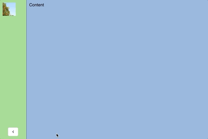
Now, let’s take a look at render method. As you can see Avatar element has own animate property, which means we don’t want to allow Sidebar element to control this animation. MenuLabel elements have only MenuLabelVariant variant without animate property. In this case we want to orchestrate MenuLabel with Sidebar element animation.
render() {
   const { sidebarCollapsed } = this.state;
   return (
     <Container>
       <Sidebar
         initial={sidebarCollapsed ? "collapsed" : "expanded"}
         animate={sidebarCollapsed ? "collapsed" : "expanded"}
         variants={SidebarVariants}
       >
         <Avatar
           src="https://picsum.photos/100/100"
           initial={sidebarCollapsed ? "collapsed" : "expanded"}
           animate={sidebarCollapsed ? "collapsed" : "expanded"}
           variants={AvatarVariants}
         />
         <Menu>
           <MenuItem>
             <MenuLabel variants={MenuLabelVariants}>Home</MenuLabel>
           </MenuItem>
           <MenuItem>
             <MenuLabel variants={MenuLabelVariants}>Dashboard</MenuLabel>
           </MenuItem>
           <MenuItem>
             <MenuLabel variants={MenuLabelVariants}>Messages</MenuLabel>
           </MenuItem>
         </Menu>
         <CollapseBtn onClick={this.toggleSidebar}>
           {sidebarCollapsed ? "show" : "hide"}
         </CollapseBtn>
       </Sidebar>
       <Content>Content</Content>
     </Container>
   );
}
Control animations imperatively
We know how to orchestrate parent and children animations, but in many projects we need to orchestrate animations of sibling elements or we have more complex sequences. In this case we can use useAnimation hook and we can control animations by start and stop methods. Start returns a Promise, so it can be used to sequence animations.
Let’s add rotate animation for sidebar button.
export const CollapseButtonVariants = {
 expanded: {
   rotate: 0,
   right: "0%",
   x: "0%"
 },
 collapsed: {
   rotate: -180,
   right: "50%",
   x: "50%"
 }
};
Next, we will add sign out label next to sidebar button. Sign out label fades out when sidebar is collapsed. Let’s synchronize sign out label and button animations. These elements aren’t in parent child hierarchy so we need to synchronize them using useAnimation hook.
index.jsx

import React, { useState, useEffect } from "react";
import ReactDOM from "react-dom";
import { useAnimation } from "framer-motion";
import { FontAwesomeIcon } from "@fortawesome/react-fontawesome";
import { faChevronRight } from "@fortawesome/free-solid-svg-icons";
import {
Container,
Sidebar,
Content,
CollapseBtn,
SidebarVariants,
Avatar,
AvatarVariants,
Menu,
MenuItem,
MenuLabel,
LabelVariants,
CollapseButtonVariants,
SidebarFooter,
SignOutLink
} from "./styles";
function App() {
const [sidebarCollapsed, setSidebarCollapsed] = useState(true);
const controlsSignOut = useAnimation();
const controlsBtn = useAnimation();
useEffect(() => {
const sequence = async () => {
if (!sidebarCollapsed) {
await controlsBtn.start(
sidebarCollapsed
? CollapseButtonVariants.collapsed
: CollapseButtonVariants.expanded
);
await controlsSignOut.start(
sidebarCollapsed ? LabelVariants.collapsed : LabelVariants.expanded
);
} else {
await controlsSignOut.start(
sidebarCollapsed ? LabelVariants.collapsed : LabelVariants.expanded
);
await controlsBtn.start(
sidebarCollapsed
? CollapseButtonVariants.collapsed
: CollapseButtonVariants.expanded
);
}
};
sequence();
}, [controlsSignOut, controlsBtn, sidebarCollapsed]);
const toggleSidebar = () => {
setSidebarCollapsed(!sidebarCollapsed);
};
return (
<Container>
<Sidebar
initial={sidebarCollapsed ? "collapsed" : "expanded"}
animate={sidebarCollapsed ? "collapsed" : "expanded"}
variants={SidebarVariants}
>
<Avatar
src="https://picsum.photos/100/100"
initial={sidebarCollapsed ? "collapsed" : "expanded"}
animate={sidebarCollapsed ? "collapsed" : "expanded"}
variants={AvatarVariants}
/>
<Menu>
<MenuItem>
<MenuLabel variants={LabelVariants}>Home</MenuLabel>
</MenuItem>
<MenuItem>
<MenuLabel variants={LabelVariants}>Dashboard</MenuLabel>
</MenuItem>
<MenuItem>
<MenuLabel variants={LabelVariants}>Messages</MenuLabel>
</MenuItem>
</Menu>
<SidebarFooter>
<SignOutLink animate={controlsSignOut}>Sign Out toggleSidebar()}>
<FontAwesomeIcon icon={faChevronRight} />
</CollapseBtn>
</SidebarFooter>
</Sidebar>
<Content>Content</Content>
</Container>
);
}
const rootElement = document.getElementById("root");
ReactDOM.render(
Bonus Tips
Variants LabelsIt is a good idea to use the same name for label variants. Otherwise orchestrating animations between children and parent elements won’t work. In this example project I used expanded and collapsed labels for all variants.
Don’t mix units in variants, which you want to animate. In the example below, you can see how animation of button position shouldn’t work.

export const CollapseButtonVariants = {
 expanded: {
   rotate: 0,
   right: "0%",
   x: "0%"
 },
 collapsed: {
   rotate: -180,
   right: "50%",
   x: "50%"
 }
};
Conclusion
In this blog post we learned how to use Framer Motion to animate components and orchestrate animations in React.js projects. We demonstrated Framer Motion library by a layout with collapsible sidebar and animating its components. At first we animated sidebar width and then we demonstrated how to orchestrate animations of sidebar itself and its components in a declarative and imperative way.
Framer Motion provides more capabilities such as passing props into variants, defining keyframes, recognizing hover, tap, pan and drag gesture detection and much more. Hope this blog post helps you build nice animations in React.js projects.